Edge CRM — Case List
Redesigning the case list a rep opens every morning — figure-ground, the F-shaped scan, and cards that triage at a glance.
The screen a rep opens every morning
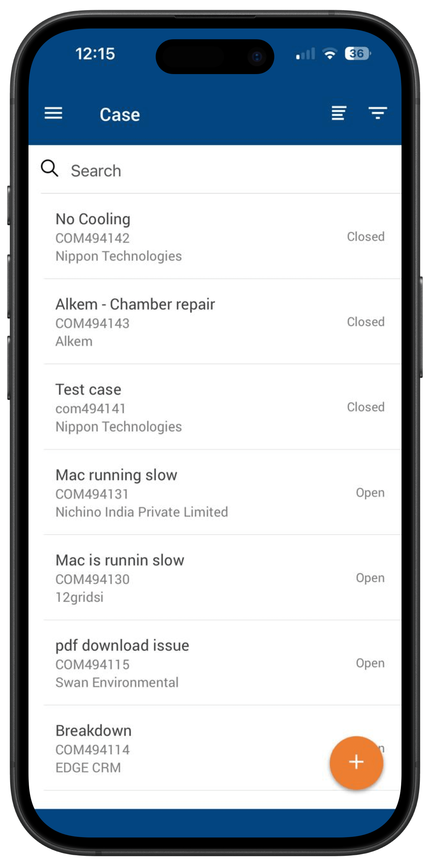
Case List is the screen a rep at 12 Grids opens every single morning. Sometimes 10 cases. Sometimes 20. All demanding attention at the same time.
It was a flat, undifferentiated list — every case carried equal weight, so the rep did all of the triage in their own head.
How might we?
Turning the triage problem into a design direction
I broke the screen down into three failures — visual hierarchy, information architecture, and interaction design — and worked each one into a concrete direction.
No visual boundary
Every case had equal weight — the Gestalt figure-ground principle was completely broken.
Establish visual hierarchy first
Everything else comes after.
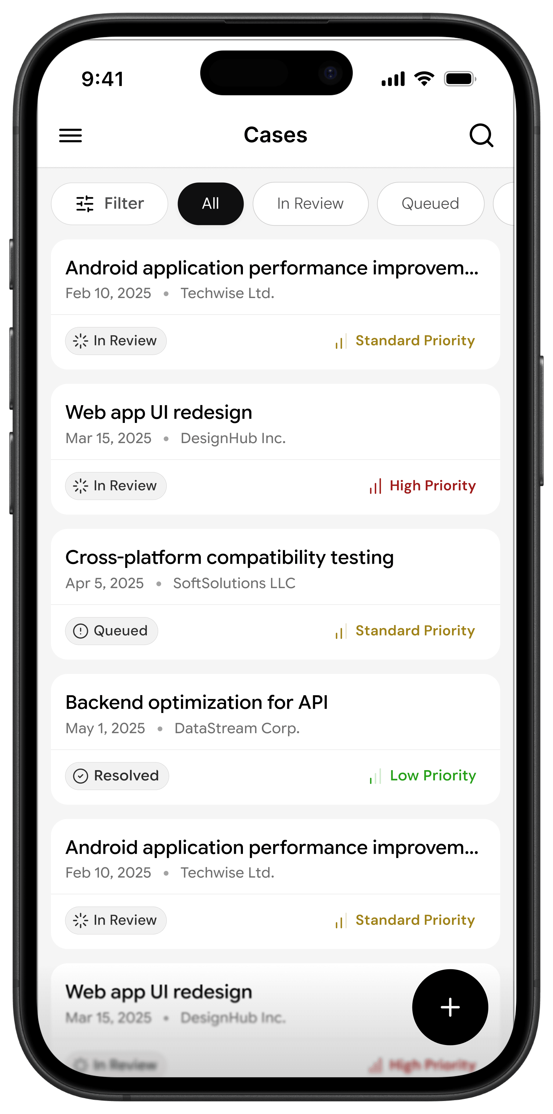
White card on a grey background — figure-ground separation restored.
Card border radius — each case becomes a distinct, interactive object.
Consistent padding — whitespace isn't empty space, it's breathing room.
No information architecture
Status and priority were missing or buried — the cognitive load sat entirely on the rep.
Surface the right information at the right time
The IA should do the thinking, not the user.
Priority label on the right — High, Standard, Low.
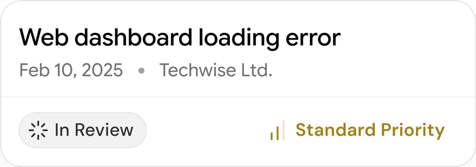
F-shaped reading flow — name, date, company across the top; status bottom-left; priority bottom-right.
Red, amber, green — the rep triages before they even realise they're doing it.
Poor interaction design
A secondary action owned the primary real estate — the search bar violated Hick's Law on every scroll.
Progressive disclosure
Show what's needed. Hide what's not.
Search moved to a header icon — revealed only when intentionally triggered.
Filter chips introduced alongside status — All, In Review, Queued.
A dedicated filter chip for advanced filtering — separate from status segmentation.
Designing with the eye, not against it
Nielsen Norman Group ran eye-tracking tests across thousands of users, and the result was always the same: people don't read screens, they scan them — and that scan follows one pattern, every single time.
Two horizontal passes across the top. One vertical drop down the left. That's the F.
So instead of fighting natural behaviour, I designed with it — every piece of information a rep needs sits exactly where their eye already goes, before they consciously decide to look.
Three questions, answered in one scan
The case card maps straight onto that scan — three questions answered in the exact order the eye already travels.
Top row (name · date · company) answers what the case is, when, and who it's for. Bottom-left (In Review · Queued · Resolved) answers whether it's active or done. Bottom-right (High · Standard · Low) answers how urgent it is.
Case name,
Date registered, Company name
What is this case? When? Who is it for?
In Review. Queued. Resolved.
Is this case active or done?
High, Standard, Low.
How urgent is this?
The before, the changes, and the after
I rebuilt the list around figure-ground and the F-scan — four changes did most of the work, each pulling one question to where the eye already looks.
Four iterations to get the card right
The card didn't arrive in one shot — it took four iterations to get right.
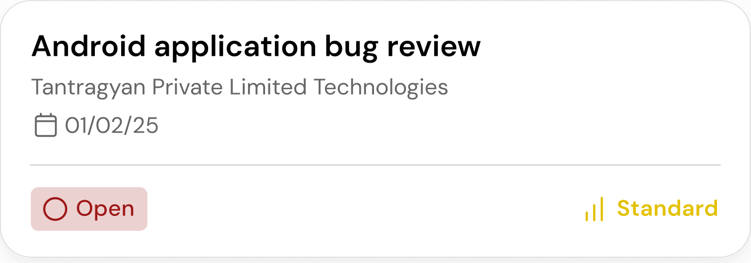
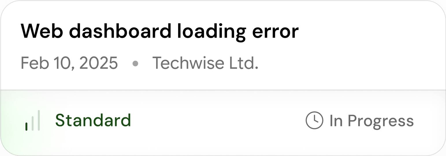
Iteration 1 led with an alphanumeric case ID, built for the system, not the rep. Iteration 2 swapped in a case name but stacked three metadata rows and two competing colours. Iteration 3 collapsed metadata onto one line, yet priority still dominated before the case name — reps were reading, not scanning. Iteration 4 put the status pill bottom-left and moved priority bottom-right, and the F-shape finally clicked: what, when, who — answered in sequence.
- 1Iteration 01

- 2Iteration 02
- 3Iteration 03
- 4Iteration 04Final
The redesigned Case List
A scannable, colour-coded Cases list where figure-ground, the F-shaped card, and status-first triage let a rep answer "which case needs me right now?" in a single glance.
This case study focuses on Case List, one screen in a three-screen redesign of Add Case, Case List, and Case Detail.